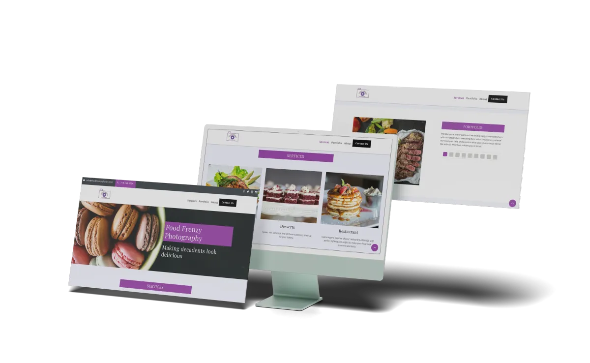
I Had a Beautiful Website—But No Clients. Here’s What I Changed.
Introduction:
I thought I’d nailed it. My website was sleek, modern, and “Instagram-worthy.” Friends complimented it, my designer was proud, and I was confident it would bring in business. But it didn’t.
Crickets. Not even spam leads.
After months of silence, I realized my site was a digital beauty queen—with no real job. It wasn’t designed to convert.
The Problem? Form Over Function
Sure, the site looked good. But:
There were no clear CTAs.
My service descriptions were vague.
I had no testimonials, no trust signals.
The mobile version? Sluggish and confusing.
It wasn’t obvious what I did, why I was better, or what visitors were supposed to do next.
What I Changed (and What You Can Too)
✅ One Clear Goal Per Page
Instead of stuffing every page with everything, I focused each one on a single action: book a consult, download a freebie, fill out a form.
✅ Real CTAs, Not Cute Words
“Let’s Chat” became “Book Your Free Discovery Call.” Way more effective.
✅ Social Proof Front and Center
I added client reviews and mini case studies directly on the homepage.
✅ Simplified Navigation & Mobile Layout
No dropdown forests or hidden menus. Just clean, click-friendly design.
The Result?
In 30 days:
Bounce rate dropped by 40%
My inbox finally started filling up
One blog post (yes, this style) got me 2 new clients
